Index:
1) Introduction and Criticism
2) Intrusive Thinking and Creativity
3) The Role of Missing Information in Creativity
4) Art and Algorithms
5) Art, A.I., and Culture
6) Autism and The World
7) YouTube Channel and Miscellaneous
Studio Photographs and Notes: Here are a few photographs of my work environment. Notes for my Inventing Landscapes with Color Pencil class, which is offered through Ivy Tech Community College, are seen on my work table in the middle set of images, while the last photographs are from classroom settings before 2021. I executed chalk drawings for instruction initially, and later switched to dry erase markers, as shown in the last two images. I have drawn countless drawings over the years for classes, and because I did own a smart phone at the time, I had no practical camera for recording them. My drawings may be compared to Buddhist sand paintings, but someone other than myself erases them.
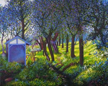
Fuchs Dystrophy and Cataracts: Due to the development of cataracts and Fuchs Dystrophy, I gave up my drawing classes around 2022. Fuchs is a corneal eye disease that will eventually require surgery, but cataracts have been the more pressing concern for me. My cataracts were successfully removed in 2024, and my vision is greatly improved. I restarted my color pencil class, but intend to run it only until I retire from teaching in 2025. My current method of drawing instruction is to use a projector, where students draw along with me. The below image was created in this way.
Reflections on The End of My Time as An Art Instructor: Like many vain MFA graduates, becoming a painting/drawing instructor was not on my radar after graduation. And yet, my path to becoming a community instructor was an uncrowded one since obtaining a similar entry level position at a four-year college was never going to happen for me.
First, there were my antisocial (autistic) tendencies, which denied me access to an inside track adjunct professorship. And then there was the brutal fact that colleges had no more interest in my surreal art than they had in my gender or skin color. More essentially, MFA graduates, vainer than myself, would never accept the job that I have performed over the last twenty-six years as a continuing education instructor at a two-year community college.
The job pays too little.
This lack of money and prestige made me ideally suited for this job because I could protect my personal creative projects from the grinding influences of a full-time academic career, where I would be required to teach more and perform additional duties. Continuing education does not demand fidelity. It does not require me to “stay in my lane,” so to speak. I have had the time—and energy—to branch out into comics, music composition, and creative writing.
The crown jewel for any college professor is to land a plush gig in a graduate program, where it is more like counseling with one’s colleagues than teaching a mixed bag of undergrads. There is a reason why tenured professors do not teach freshman classes: They have paid their dues, and so have been liberated from the Sisyphean struggle of repeating themselves endlessly in lecture halls before an onslaught of new students. Regardless where you land on the higher education ladder, few find personal enrichment teaching freshmen taking electives.
Still, I have achieved something similar to the graduate school advisor effect by cultivating repeat business with my continuing education students. Many of whom have been with me for years. I enjoy my time with them, but will enjoy that time more once I have retired from teaching my other classes.
Modernist Aesthetic: I admittedly credit myself with an immodest degree of uniqueness, which stems from my formative exposure to and adaptation of Modernism in art school. As a creature of this Twentieth Century aesthetic, I spent a portion of my formative youth rebelling against the ruinous tyranny Modernism became through art academia in the 1980s. By the time we get to Postmodernism, and its glib politics used to justify the lamest banality imaginable, those distant European pioneers, who inspired me to apply my imagination first and foremost, were long dead and relegated to the pages of art survey books.
Modernism is ended in its best sense, and what we are left with are self-aware parodies of its once revolutionary ideas (as found in anachronistic, factory-showroom Manhattan galleries). Today we live in an era of post-ism-ism, where everything is allowed. There are many more crafty artists than in times past, especially where artists accomplish unparalleled levels of achievement by furthering styles originated in other epochs. This unprecedented commitment to doing-one-better has given us a kind of replicable scientific algorithm.
Imagination and Its Enemies: Three ways of thinking about art creation dominate: abstract, figurative, and figurative-abstract. As someone who has dabbled in the first two, abstract art is harder to make than you realize, while figurative art is easier to make than you realize. Neither approach requires much imagination as an ingredient since the inherent structure of the art is nine tenths of the final product. Yes—some imagination is required to make tweaks to the formula, but the body of work in all three approaches is so well established that proficiency alone becomes the measure of achievement. Therefore, the lowest common denominator among proficients becomes the prevailing style.
Art movements become victims of their own success, since more artists are able to meet the proficiency test. Unless you got in on the ground floor for one of the variant offshoots in style or subject matter, then (to put it bluntly) you are merely a copyist of someone else’s hustle. A. I. art generators such as Midjourney are next generation style hustlers, and this hustle, like air brush art of the 1980s, has already reached its shelf life as of 2024.
While there may be many cooks in the kitchen, only one of several broths are available for finetuning, so what is required to succeed begins to look more like ability than imagination. This makes it easy to marginalize imagination, or damn it with faint praise.
This chalk and charcoal abstract drawing on paper dates from my MFA days, and is a rare success for me in this incidental style.
My Personal Figurative-Abstract Dilemma: Though I am critical of the default settings for Postmodern abstract painting, I nevertheless admire talented individuals working in this area. Still, there are many more artists trying their hand at abstraction than succeeding at it.
I prefer fussy-ness in all things, so the engineering aspect of abstraction, when done intelligently, holds great appeal. Because of this I prefer my abstract painters straight, with no chaser.
Apart from the genius of a Francis Bacon, figurative-abstract mashups can be a tricky business. The figurative (or narrative) part of the equation is often shoehorned in; and the viewer may be disappointed to find it, like graffiti, scribbled into the margins.
This is my mature assessment of my own flirtation with abstraction from the mid-1980s through the mid-1990s. My retreat from this approach was complete once Pop Surrealism crossed my radar, and its vitality gave me permission to abandon Modernism as a relic of art school. Resultantly, I abandoned abstract experimentations before I resolved my issues with the style. (Discussion of this identity crisis is presented in my Portfolio pages.) I became an unambiguous figurative painter around 1997, even though I continue to include minor abstract elements in my work to the present day.
I would not have characterized the work of my lost years (1987-1997) as figurative-abstract painting, but it looks that way in hindsight; and it is along these lines that I may properly evaluate this history in 2024:
Owing to my detour through art school, I was trying to reconcile my love for fine art, in all its diversity, with my fertile imagination. Simultaneously, the art world had become hostile to not only figurative art by 1987, but to anyone like myself. Withdrawing from a community to which I never once professed an allegiance posed no hardship.
By 1990 I was not only disenchanted, but directionless. Comic book art ended up being easier to make, easier to store, and a better fit for my talents during this decade—at least until I had said all I wanted to say with this art form.
Where Figure-Abstraction does not Translate: Factors influencing my lack of success as an artist are discussed in several places throughout this website, and here is one more: Apart from Robert Williams’ parody of modern art tropes in his early low brow paintings, few Pop Surrealists stray into these dim recesses of academic formalism. They feel more comfortable with vintage commercial illustration as a starting place, and perhaps harbor some prejudice against those who have MFA degrees in painting.
The Low Brow movement was—and is—hard-core figurative. I fully understood this philosophy in 1998 when I first exhibited with this group of artists. From my standpoint, I was figurative, for all practical purposes. No difficulty presented itself in my mind, although, as someone with autism, I am often the last person to read the room.
It is possible that my art was quietly rejected in 2002 because of my use of “fine arts” as a framing device. Nonetheless, some Pop Surrealist works from this time show clear postmodern influences in styling, especially in the paintings of The Clayton Brothers and Camille Rose Garcia. A key difference is that figure/ground principles are less violated in their works than in mine. In-between experimentations never err in my favor in any creative pursuit, and here was no exception.
My abstraction does not function as defacement, but rather it is an integral design feature to the depicted objects themselves. These distortions are dynamical and atomic, and represent a form of picture thinking that any art school student would recognize. Defacement, where Pop Surrealists allow it, is typically seen as punk disruption, post-urban decay, or a weathering feature. Unlike my work, inclusion of these cosmetic effects should never be confused for commentary about Art Historical Canon.
The Engineer versus The Path of Least Resistance: Being autistic, it is hard to escape my scientific approach to making art. When I look a painting, in any style, it is to access how successful it is in terms of color, composition, tonal balance, execution and, lastly, concept. While the first four of these factors are apprehended visually, concept is less to do with the theory or idea behind the work of art and more to do with the inherent baggage that is pre-loaded into the style.
Concept succeeds if it integrates successfully with the other factors. Concept fails if the artwork’s raison d’être is quickly seen through as gimicky, low effort work.
A young artist will work earnestly, and with exceptional craftsmanship (execution) to distinguish him or herself. This commitment is to stake their emerging reputation on a new direction. Unfortunately, as one ages, and there is less to prove should one become successful, the artist may cut corners. It sometimes feels like they only enter their studios to print money, as inferior late works begin pile up, alarmingly, at the door.
This may be the natural course of things for aging artists. And yet human nature is always testing the bondaries for tolerance: What can you get away with? Postmodernism openly champions “the death of the artist” by throwing out all standards for measurement: There is no such thing as excellence. And the art world—which is all about printing money—happily goes along with this sullying of its ages-old reputation. As long as money and reputation are the main drivers, it will be difficult to dislodge these tired habits.
Perhaps this endgame of mediocrity was always baked into Modernism, long before the term “Postmodernism” was coined. After all, Minimalism and Conceptual Art were the first camels to get their noses under the tent. However, I find more craftsmanship in the minimalist works of Ad Reinhardt and Mark Rothko than I do the late works of Joan Miro and Henri Matisse.
early Miro, late Miro.
Perhaps this acceptance has to do my conditioning as an MFA graduate, but as stated from the outset, I am an engineer who appreciates fussy-ness. My tastes notwithstanding, we are a long way from the subtle brushwork of a black Ad Reinhardt painting, which at least required time and consideration in how it was put together.
Some New York artists openly flaunt their contempt for even these simple virtues, although this trend is less prevalent today than it was in the ruinous 1990s, when everyone was a half-ass artist. (This half-ass-ness is yet one more reason why I found fine art painting to be a hopeless mess after art school.)
Art critics and propagandists hold less sway these days, even if artists and their pretentious artist statements try to take up the slack. In each defense, more time is spent trying to justify a grift than the grifter spent making the grift. Saying “art should challenge the viewer” does not fly as far as it used to.
My general advice: If it looks like a dog turd from two feet, then treat like a dog turd. A painting should be regarded as a precious stone, where each fleck of discarded diamond, left to gather dust on the floor, is put there only to improve what remains behind on the easel.
All else is vanity.
Robert Nava, New York Artist, is unsurpassed at polishing dog turds.
A Crisis of Scale in Modern Painting: White backgrounds work well as framing devices in abstract construction, and this feature is easiest to supply within my own elaborate part-to-part approach to drawing on paper. This method of assembly is ideal for surrealism, but things get complicated when you scale up to the dimensions of a painting.
When empty space is dramatically enlarged in a painting, horror vacui is a natural response to it. Most abstract painters opt for scale over finer rendering skills just to get at solutions faster. Abstract paintings generally complete faster as a result, and (unfairly) the artist may charge more for large paintings. Consequently, one needs to think oppositely about how to build them by first starting with the whole composition, at least in broad outline, and then dialing in the minutia.
Scalability has been the driving force behind Modern Abstract painting. And yet, the large brushes and trowels used to create them lack personality and warmth up close. Oversized paintings often look better further away; but to create them requires the resource of a large studio space. Hence, one must be in possession of significant resources to enter this competitive field, even speculatively. This is one of the first links in a chain of self-reinforcement for a style that, without this funding, would be downgraded to just another style put on life support.
Scale gives abstract paintings the appearance of a substantial materiality. Large paintings are, after all, the prerequisite of American painters. This being true, large abstracts are rarely as involved as one finds in paintings of comparable size from the Nineteen Century, such as with Hudson River School landscapists or Albert Bierstadt. Abstracts of scale do not translate well in intimate spaces—and much like a pair of inappropriate prescription lenses. Modern painting evolved to fill the corridors and lobbies of skyscrapers. Unfortunately this form-follows-function aesthetic now seem somewhat wasteful in our modular age of handheld digital devices.
As skyscrapers fall into decay because the world no longer needs them, the art that decorates their walls will need to be removed to museum storage for lack of a second act.
Albert Bierstadt
typical Gagosian Gallery painter
A Crisis of Value in Modern Painting: The problems of society are never as glib as critics confess to believe, namely that sexism and racism bar the way against the emergence of new talent. Every other New York gallery exhibition, on any given day of the week, makes these complaints the centerpiece of their artists’ statements, which are often as predictable as the art itself.
Yes, there are women and people of the color who make no headway in the art world. The same may be said of most everyone else, too. The only true “ism” in the art world is classism, because wealth trumps all.
Most artists who exhibit at Gagosian or Hauser and Wirth become wealthy by proximity to wealth. The rich people who move in their circles artificially inflate the value of their art by agreeing to pay huge sums for it. Moreover, a handful of global galleries and auction houses function as middle men to launder these transactions.
It is a cartel, pure and simple. By fixing prices, the art and collector are protected from fair market forces that would otherwise drive down value of these investments. Consequently the art world is an insular community of privilege, where one finds a laughable degree of self importance and virtue signaling. It would be tragic but for the fact that you will never reach these individuals with compelling lectures about insularity. Vast swaths of private property impede your way. The rich have no notion of your existence, so are never in danger of being enlightened on any subject.
Modern Art and Its Enablers: When I was a graduate student at Indiana University working on my MFA degree in painting in 1986, Modernism was on its last legs. Basquiat was one of the last original voices to emerge from it, and his style of defacing Modern art tropes by tagging them with graffiti anticipated much of Postmodernism that followed. It slowly dawned on many within the community that every abstract and figurative-abstract cliché had been done to death by the late 1980s, and what was left as an option was to acquire a poor memory. That is, to approach each gallery opening on its own terms without reference to what came before.
Technology would soon entry the fray; and with the introduction of 3-D printing and other digital assists, the conversation was modified to include feats of computer engineering. Gallery spaces became interactive science expos. One came to see insights in traditional media so rarely that it was possible not to recognize it. Gallery art, without apology, became retreads of retreaded ideas, which is not to say that the art was bad. However, when one steps through a gallery door nowadays, the art one encounters on the walls is anticipated too perfectly.
True critics do not exist anymore in the art domain, and perhaps because, like Old Testament prophets, people got tired of hearing them publicly bemoan the death of art. The 1990s was as horrific a decade for fine art as it was for commercial art. Everyone was ready to move on in the new digital millennium.
Warehouse Art and Postmodernism: One conversation ceased (Modernism) while another (Postmodernism) replaced it. This second conversation recycled modernist ideas through new filters, although few artists would label these appropriations so plainly. Identity politics and those aforementioned advances in technology are suitable distractions, while the art itself is pushed further into the background where it can serve as a prop for selfies, or provide shade for baby strollers. Unsympathetically, visual fine art has long passed its vital moment in history.
As a consequence, art expos in large airplane hangers have become a trend. One can see hundreds of gargantuan paintings in rapid succession without spending too much time standing in one place. It is, if nothing else, aerobically effective as exercise. The precise manner in how these expos come about is unknown to me, but it is doubtful that independent artists, unaffiliated with any gallery, are paying for speculative kiosks and wall space out of their own pocket. These large scale urban exhibitions are not your typical street art fairs.
Sandwiching artists into these warehouses is a sign of the times since short-attention spans pair well to them. Artists are packed like sardines, toe-to-heel, into these spaces. It is similar in design to a smartphone screen where one can scroll through images like passing through the spray of a brief summer downpour. The brisk movement exhibited by patrons suggests that few (if any) paintings will be sold to eager collectors. A mother with a baby carriage is not a good prospect for a sale. Somehow bills are being paid for these expensive exhibitions, but this method may resemble a Ponzi scheme if one inquires too closely.
The Twilight of Empire: As of 2024, one sees a die-off of genius across every creative endeavor, from films to gaming to the arts. A range of YouTube channels will describe this decline variously, from the shoehorn insertion of DEI (diversity, equity, and inclusion) agendas into creatively diminished products, to the greed of large media conglomerates buying up aging intellectual properties in the vain belief that an eternal spring of juice can be squeezed from these dried-up fruit husks.
Younger consumers have no great affection for whatever repackaged bleached bones Hollywood is still serving up on plates. Greed of this sort destroyed the music industry when an artist’s past catalog became a form of crypto currency, and was worth more than any future song that artist might write. New music is no longer needed from anyone—or so it is believed.
Fine art and creative fiction were perhaps the first casualties of this culture war in the 1980s. Identity politics was seen as a suitable substitute for imagination. And given the longevity of this trend to the current year, these grifts are practically inexhaustible since elitists are primed to receive the messaging. For all others, only the art is left for consideration; and very little consideration is paid to the art. Were it not for curators validating these grifts through museum and gallery exhibitions, no one would think it amiss to find much of this “art” in the dumpster out back of the building. Veneers of respectability are often pretenses, and crutches where the art cannot stand, unassisted, on its own two legs.
Accomplished artists do not need sociopolitical justifications when their art has demonstrated merit and uniqueness. And yet, justifications are often self-assigned by the artists themselves. The art world encourages this political spoils system, which contaminates all participants by placing merit at the back of the line. No one benefits more from such a system than its lesser members.
My criticism of this inversion of value, where the welfare of the group is put before the achievement of the individual, is perhaps the difference between an autistic view of art and a non-autistic view. With the latter, the artwork is often ancillary. It is a means to an end and not an end in itself, and is mostly forgotten the moment the patron steps outside the gallery door.
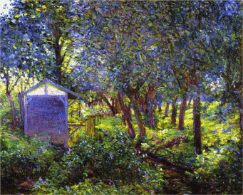
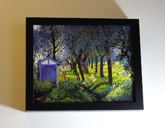
A Day in Saugatuck, MI (2014)
The Ascendancy of Winning Formulas: Where Postmodernism has improved on the “abstract painting” formula is by adding decorative flairs to the planned disruption. Paintings these days—whether encrusted, stressed, monotoned, or saturated in bright primary color—are calibrated for effect. They are pleasant to walk by hurriedly, as if on the way to a table in a high-priced LA restaurant.
One could argue that abstract painting is just another form of figurative painting. If one steps away from the canvas and squints, the assoication is vague but certain. Flora Yukhnovich is a young painter who creates colorful and attractive abstract paintings. I was drawn to a video about her work because, from a thumbnail size title card and preview, her paintings resemble Baroque/Rococo paintings in color, tonality, and design. One not only sees the influence of Tiepolo and other art historical painters, but the actual schematics for the paintings themselves.
This is not the first time I have seen repurposed Baroque/Rococo motifs in recent years. While mapping out my first YouTube video about A. I. art, I had occasion to download several A. I. thumbnail examples onto my iMac. In miniature, they perfectly resembled Flora’s appealing paintings. A. I. art generators like shortcuts, with a heavy use of misty backgrounds and contorted human figures where these generators cannot work out the precise business with arms, legs, and hands. (I discuss “A. I. latent spaces” later in my blog pages about A. I. art.)
It is possible that Flora may be using A. I. to create many of her paintings. In which case, she is no different than any other photorealist working today, apart from her images being more photo than realist. Doubtless painter Gerhard Richter, whose photorealist period included the recreation of throw-away Poloroids, would have stumbled over this artificial means of image generation had it been available to him at the time. We are not talking about the ploymath powers of a Leonardo da Vinci here, but rather an ambitious artist getting to a new obvious resource first. Regardless, this strange convergence between technology and modern fine art sensibility is only to underscore Hegel’s view of history: An idea will find its time to appear everywhere and all at once—and not a moment before!
Flora Yukhvonich painting
Tiepolo Baroque painting
A. I. abstract painting
A Crisis of Contraction in Modern Painting: I generally steer clear of fine art these days. However, in recent months I have toured numerous gallery exhibitions via YouTube, which has only reinforced my impressions about what is on view. Algorithmic repetitions over the decades have supplied sure-fire refinements in studio practice. Minimalist doodles and splotches, better suited to the back of Denny’s restaurant napkins, are mercifully less current, while color-saturated figurative-abstract paintings, assembled in scattershot collage fashion, are everywhere.*
Flora Yukhnovich is but one example, yet in many instances abstract painters simply rush to fill—and satisfy—the brain’s deep-wired need for templates. This is a universal precondition placed on every artist and viewer. I call this “The Rules of Landscape.”
Yet for all my ballyhoo about abstract art, a fair number of diligent figurative painters can still be found in first tier galleries. Jonas Wood is highly involved with his paintings, which resemble assemblages of intricate press-on decals built up as complete pictures. He is deserving of praise, as is Izzy Wood for her desaturated photo collages paintings, which put me in mind of a less kinetic version of postmodern David Salle, circa 1990.
There are other accomplished New York artists, of course, although none are so gifted as to appear out of place in any commercial gallery exhibition in any American city. The question is: why these artists, since the only thing exceptional about their paintings is the extra work they put into them?
Exploring idiosyncratic photographic sources, with various techniques, is the most common form of figurative painting. Exhibiting within a Manhattan zip code adds nothing of note to this formula beyond a high price tag, and the opportunity to improve as a practicing artist because one receives financial compensation for it. Any artist with raw ability and drive, working under these favorable conditions, will thrive.
To be clear, New York artists may be successful because of these privileges, but they are not famous. There are no more famous artists because there is nothing new left to say. Whether in acknowledgement of this fact, or the cause for it, first tier galleries are unapproachable. Few if any galleries, of any tier, accept submissions from unknown artists. One might call this a contraction in the market, except that the most talented artists working today are often locked out of these spaces.
(*) I might count myself among the vanguard in this trend as well. My figurative-abstract collage paintings (1986-1996) are in keeping with the current cluttered aesthetic one sees in high-toned galleries. Four of these paintings are featured in the foreground of the below photograph. The location is upstate New York, and the house (plus paintings) belong to friend, Tommy H. Hyndman. A few of these paintings can be seen in greater detail in my latter Portfolio pages.
Worth More Dead Than Alive: There is nothing rational or fair about the art market, although the best career move for any artist is to pass away. At this point, his or her output of work ceases; and the art world loves nothing more than scarcity. An artist’s catalog of works becomes a fixed commodity; and like all scarce resources, its value is driven a combination of luck and whim.
I cannot speak to the market forces behind the art world other than what I have heard: It is better to have one’s art placed with museums and serious collectors than it is to sell one’s art to the highest bidder. Over the long haul, this makes sense, but this is still artificially inflating the value of art by laundering it through select institutions.
Much of the high ticket art that winds up is serious collections is just god awful: poor ideas, poorly executed… The more this art leaves you feeling barren, uninspired, and soulless, the more these lucrative transactions feel like rich people paying to be publicly berated by their inferiors: first for having too much money, and then for being too ignorant to recognize better art. Even when the bludgeon is fashioned in this clear, declarative language, the object of abuse cannot recognize it: When Marcel Duchamp belittled the art world by writing “R. Mutt” on a urinal and calling it art, museums paid to line up and get their very own urinal.
To reiterate, mainstream fine art has become more decorative in recent years, and so is more self aware of winning formulas and craftsmanship. This late revival comes with no refunds on purchases of earlier, less refined art, however.
In historical cases the quality of art often matches the celebrity attached to it, as with the works of Vemeer. But there are many Baroque artists to match Vemeer, of whom no one has ever heard. Celebrity and a high market value indicate successful branding. However, with the growth of modern markets, supply outpaces demand—if never quality! Should one be able to recognize it! Resultantly quality is harder to come by, if only because it has been locked out of the equation. Its very existence drives down the value of all the other stuff, which is yet one more excuse to keep it out of sight. Yes, scarcity wins out in the long run, but the artist has to be dead for that truth to emerge…
And we are all poorer for it.
YouTube’s Heat Maps and Uncomfortable Truths: While watching the aforementioned videos centering on art gallery shows, one can track other viewers’ interests by pulling up that video’s heat map. Heat maps present a visual graph showing where viewers concentrate.
Yes, strolling tree-lined streets and visiting quaint bistros receives a predictable amount of interest, but one can also gauge overall engagement with individual artist exhibitions. Those artists who receive the most heat are usually the most talented or industrious within that video.
Without fail, people are more interested in engaging art than less engaging art. Appeals for how important the less engaging art is, amount to nothing. This judgment is akin to reading insurance actuarial tables and finding out uncomfortable truths about human nature: People want to look at pretty pictures and eat Pain au Chocolat.
I have more to say on the culture of art later in my blog pages.)
Copyright © 2024-2022 michael l. teague all rights reserved.