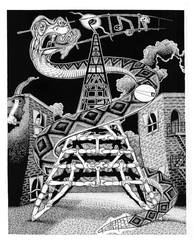
Heroin Tower from Art/Life
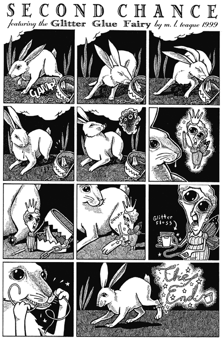
Second Chance from Lost Soul Companion
Beyond Epic Dermis: I created a few pieces that were not strictly included in the Epic Dermis volumes. These were commissioned pieces.
Heroin Tower from Art/Life
Second Chance from Lost Soul Companion
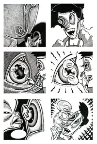
Crosscurrents: The reader will notice a preponderance of anatomical schematics throughout the pages featured in this section. This was also a theme in my paintings of the time. There is nothing so alien as the workings of the human body, especially where one attempts to understand the nature of reality when superimposed over this strange physical mechanism.
My approach in these comics is, as I have mentioned, closer to a fine arts aesthetic than straight narrative comics. I can only view these late works as stalling tactics until I worked out the precise synergy between divergent creative interests.
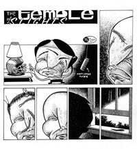
The Temple of Slights: The removal of text, on this occasion, was an improvement, but this comic is otherwise unfinished.
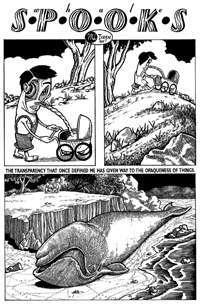
Whale Spooks: It is amazing how age improves one’s critical facilities. Where I labored over text and images in my younger days, I now find no difficulty in removing problematic material or significantly altering it. This likely owes to disintegrating attachments. Comics that strive to be conceptual must rethink the point and purpose of every aspect of the medium, including the inclusion of text. Here I have taken poetic lines that were, at best, obscure, and made them more obscure by obliterating them.
(Storyboards appear in linked pages.)
Whale Spooks Appendix: These alternative pages were not used in Whale Spooks due to their slapstick nature. They did not fit into the flow, so were removed. (Storyboards appear in linked pages.)
Al Columbia as Influence: Al Columbia is my favorite alternative comics artist, and his influence shows up in my character design near the end of the final version of Whale Spooks. My first encounter of his work was through an issue of Fantagraphics’ anthology Zero Zero, in which a couple of my pieces were also featured.
I believe Al Columbia is, like myself, an aspergerian. A streak of autistic perfectionism drives his work, and this proves so much an impediment that he has turned his failure to “finish” comic pages (including captions and stories) into his unique style. At some level I believe he appreciates the limitations of the medium as a means-to-an-end, and by sabotaging those ends he enters a deconstructing postmodern landscape.
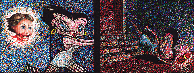
Here is an excerpt from my comic, Mother and Child, circa early 2000s. It is my own attempt, like Al Columbia, to co-op The Fleischer Studios by turning Betty Boop into a grotesque. In Spinal Sponge (below), I do something similar to Popeye (also via Fleischer Studios).
Humor and Surrealism: While I am aesthetically attracted to Al Columbia (and also Jim Woodring) as alternative comics artists, Michael Kupperman is closer to me in style and intent. His quirky sense of humor is perfectly paired to his over-elaborate drawings, which work almost like woodcuts. He straddles that line between being a straight-gag cartoonist and a conceptual artist.
I am not a Jewish New Yorker, but I have always been attracted to this style of humor, beginning with The New Yorker cartoonists, and humorists like George Kaufmann and S.J. Pearlman who both wrote for The Marx Brothers. This attraction stems from my love of surreal wordplay and high-spirited antics. One also sees this irrational current in the dark but understated works of Edward Gorey, but also, less darkly, and with less understatement, in Laurel and Hardy film shorts.
As should be evident by my work, I was not only torn between being a fine arts artist and a comicbook artist, but I was also torn between being a cartoonist and a comicbook artist. These different approaches originate from different impulses.
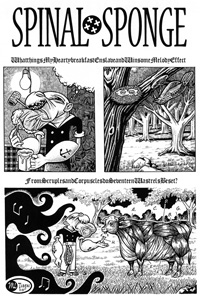
Spinal Sponge: This is a second version of this comic. Despite every attempt to be recondite, one can just about glean a plot from these pages. (Storyboards appear in linked pages.)
Design Flaw: The screenwriter Charlie Kaufmann made an astute observation when he said every creative media should do what it does best; and therein also lies its central defect. I have been asked why I have never made a graphic novel, and the simple reason is that I can either be a good writer or I can be a good artist, but I cannot excel to my ability at both simultaneously.
Graphic novels are best when the flow and tone of the visual artwork is emphasized, and where what little plot exists is conveyed minimally. Text gets in the way by becoming unwieldy and blocky when there is too much of it. Far worse is when it redundantly describes what the artist has drawn. The mere clumsy fact of its inclusion interrupts, truncates, or destroys many an otherwise attractive page of drawings.
When the written word is allowed to shine, the graphic novel borders on becoming a novel with spot illustrations, which is something else entirely. This limits the theatre of operation for the writer who, in his literary element, is capable of expressing complete, self-contained universes through the written word alone. Yet in possession of such means and ends he writes a novel and not a graphic novel.
Where the writer excels at creating worlds of thought, how then does the illustrating artist depict this nonverbal (and often non-visual) world? One must answer that he does not, so he strays into holding patterns. Psychedelic splash pages are presented, or mood-evoking still-life subjects are drawn until the linear story is rejoined. Here co-creators work at cross-purpose where they create dead corners for one another.
Next/ Back/ Comics Portal Page
Copyright © 2018 michael l. teague all rights reserved.